This is the video playing on 3 screens in the space. I decided on the three screens as it created a bigger impact especially with the flashing and it created a better visual balance for the piece. Also the video playing on the smaller tv started slightly off sync which wasn't that noticeable at the start but as time went on it got further out of sync. This actually worked really well as it was like adding extra layers to the original video, adding to the sensory overload and being bombarded by multiple things at once, the fast pace of the video, the confusion and the the slightly overwhelming relentlessness. Here you don't quite get how impacting the flashing is but for the exhibition I had to put a warning on the entrance to it about flashing lights.
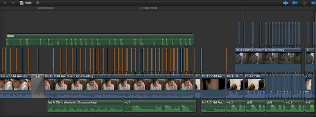
This is the video that was played on the screens. Once it gets to the close up of the deep fat frier it plays that on repeat for about 3 minutes or so. I put this bit in for the exhibition as I felt like the video should have breathing space between the intensity and also so my piece in the exhibition didn't dominate everything and take over. I wanted people to be able to enjoy or experience other works without my video blaring out all the time impacting on others work. I originally was going to put tv static in between as I was displaying the video on tvs however I found this bit in the documentary and thought it went well with the theme of the rest of the video and was a nice interlude as it even though it is boiling fat it was quite nice to watch in a slightly mesmerising way and it just has a repeating quiet bubbling noise with it. When we had a the crit a someone in my group thought that, that was just the video as he came when this bit was playing and it was interesting to hear him say how much he liked just that bit playing with the setting I created. This space that I created in-between made the main video part more impacting as the frier is so subdued in comparision.
The video like previous videos is taken from the documentary , "child anorexic" filmed in rhodes farm where my sister was in hospital for quite a few months. Again like I have said I want to create something that shows/highlights their inner turmoil, confusion, overwhelmingness of the illness and repetitive negative thoughts that creates something disconcerting, attacking of the senses, confrontational and all consuming for the audience to experience. I tried to achieve this through repetition of phrases and clips and flashing.
Something different I tried in this experience was to create a more of an installation as before I have just shown my videos on a screen here. The setting of the bar helped a lot with this as they had the big tv screen and chairs and tables. It would normally be a place where people would sit down and socialise maybe having a drink and something to eat potentially with something on the tv in the background maybe showing a sporting event or music video. So I played on this aspect and used a table and chairs round the screens and served sweets and crisps and nibbles which people were allowed to eat. People sat down with friends eating the food with there drinks or stood up with their drinks eating and then my awful video would come on with the subject on anorexia, I wanted to see how people reacted and I liked the slightly ironic aspect of this. This also mad my work on some level interactive which is something I have never done or thought about really. I liked the engagement people had with my piece as some weren't sure if was with my piece , whether they were allowed to eat the food or if it was just food provided as part of the private view.
This exhibition has made me think about how I show my work more and thinking about creating more installation pieces instead of just showing a video on a screen. I think the installation aspect creates more of an experience for the work which hlps the concept behind it.
This is a video of the video playing on two screens which I was experimenting with at home and discovered it worked better than on just one screen. This then lead me to using three screens in the exhibition.


No comments:
Post a Comment